
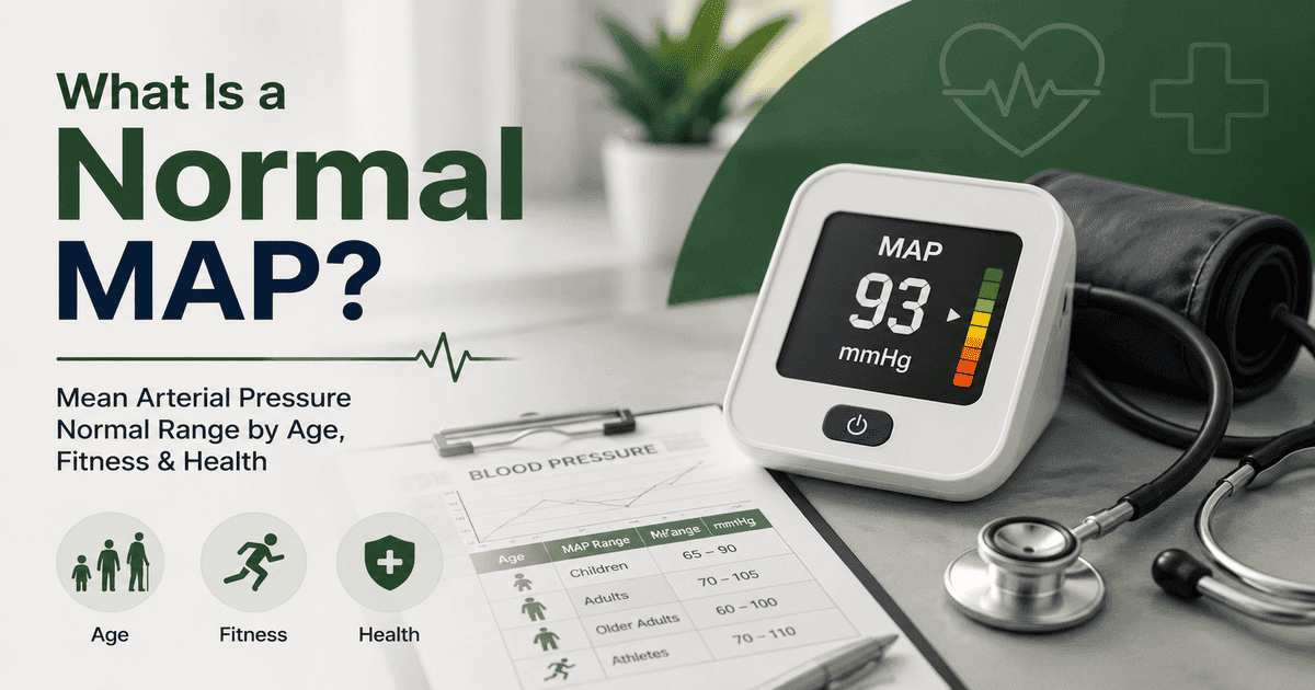
Short answer: The mean arterial pressure normal range is 70 to 100 mmHg for most healthy adults at rest. That band comes from organ perfusion, not from cardiovascular risk. On 24-hour monitoring, risk starts climbing at a MAP of 92, well inside the band every calculator calls normal. Enter your reading below and I will show you both numbers.
So “normal” is doing two different jobs at once. One says your organs are getting blood. The other says your arteries are aging quietly. Most pages only tell you the first one. This guide gives you both, plus the reading that fools MAP completely.
Enter your blood pressure reading — full ranges explained below.
Got your number? Now let’s read it properly.
What Is the Mean Arterial Pressure Normal Range?
Mean arterial pressure is the average pressure in your arteries across one full heartbeat. One number that tells you how hard blood is actually being pushed into your organs. It is often a better signal of perfusion than the top number alone, which is why hospitals watch it and home monitors mostly ignore it.
Here is the reference range most clinicians use for adults at rest.
| MAP (mmHg) | Category | What it generally means |
|---|---|---|
| Below 60 | Critically low | May be too low to perfuse vital organs, urgent if repeated |
| 60 to 69 | Low | Below ideal, often fine at rest, worth watching |
| 70 to 100 | Normal | Adequate blood flow to your organs |
| 101 to 110 | Elevated | Above ideal, heart and arteries working harder |
| Above 110 | Very high | Significant strain, get your blood pressure checked |
These bands are clinical convention, not thresholds fixed by any guideline. The one anchor that is genuinely evidence-based is the 60 mmHg floor needed to perfuse vital organs. Everything above it is a rule of thumb that has been copied from page to page for decades.
Worth knowing before you read your own number: 48.1% of U.S. adults, or 119.9 million people, have high blood pressure at the 130/80 mmHg threshold. High is not rare. It is the majority position in middle age.
One note on the math. MAP weights your diastolic number twice as heavily as systolic, because your heart spends roughly two thirds of each cycle relaxing. Our calculator runs that for you. See exactly how MAP is calculated. This guide is about what the answer means, and where it quietly fails.
The Blind Spot: When a Normal MAP Hides High Blood Pressure
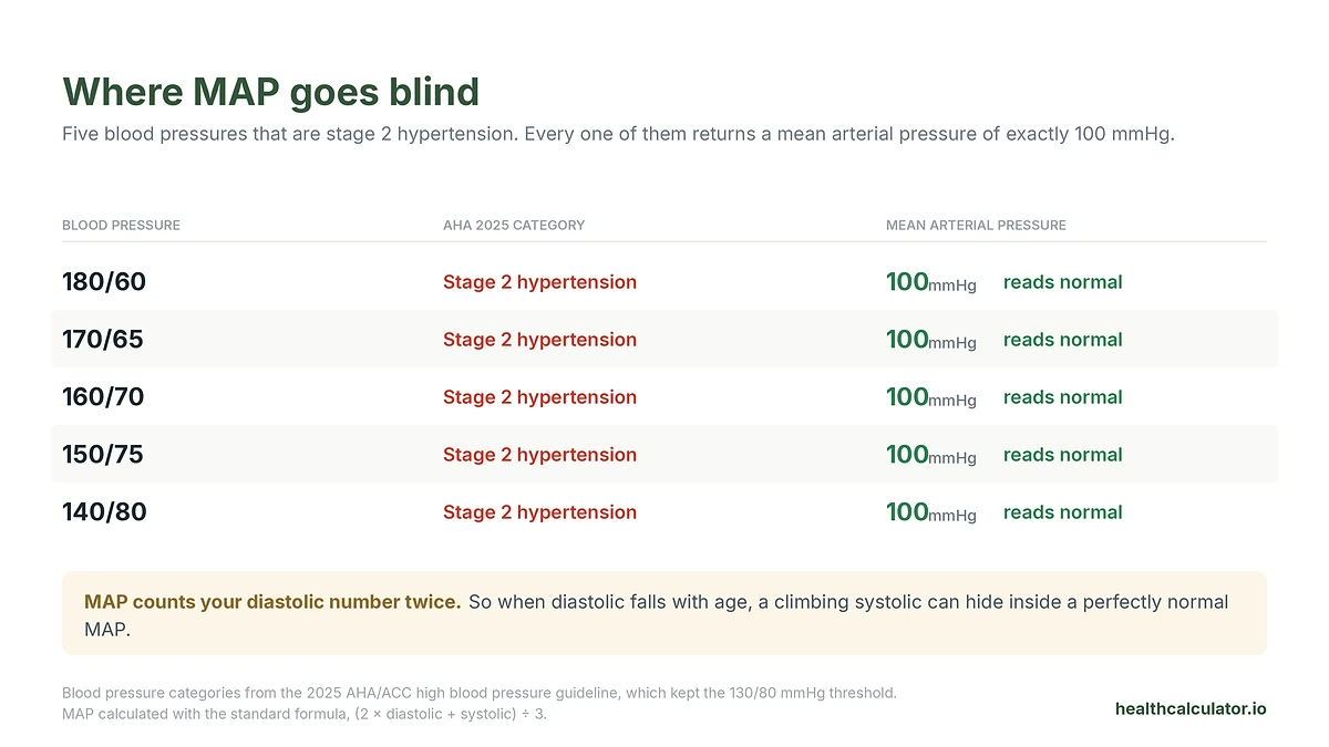
Here is the thing almost nobody tells you, and it is the single most important line on this page.
Because MAP counts diastolic twice, a reading with a very high systolic and a low diastolic can produce a MAP that looks perfect. Not borderline. Perfect. I ran every combination through the standard formula, and the result is uncomfortable.
| Blood pressure | AHA 2025 category | MAP | MAP says |
|---|---|---|---|
| 180/60 | Stage 2 hypertension | 100 | Normal |
| 170/65 | Stage 2 hypertension | 100 | Normal |
| 160/70 | Stage 2 hypertension | 100 | Normal |
| 150/75 | Stage 2 hypertension | 100 | Normal |
| 140/80 | Stage 2 hypertension | 100 | Normal |
A blood pressure of 180/60 returns a MAP of exactly 100. Top of the normal band. Every MAP calculator on the internet, our included, will tell that person they are fine.
They are not fine. Under the 2025 AHA and ACC guideline, stage 2 hypertension starts at 140 systolic or 90 diastolic, and the 130/80 threshold from 2017 was kept unchanged. That same guideline does not mention mean arterial pressure once.
Who actually lands here? Older adults, mostly. The Framingham Heart Study followed 2,036 people and found a linear rise in systolic pressure from age 30 through 84, while after age 50 to 60 diastolic declined, pulse pressure rose steeply, and MAP “reached an asymptote.” Read that again. The exact pattern of arterial aging, systolic up and diastolic down, is the pattern that walks you into the blind spot. And MAP flattens out precisely when it should be sounding an alarm.
So here is my honest rule, and it applies to our calculator as much as anyone’s. MAP is a second opinion, never a first one. If your systolic is 140 or higher, or your diastolic is 90 or higher, you have hypertension no matter what your MAP says. Check the two numbers first. Then check the average.
Two Rulers, One Number: Perfusion Normal vs Risk Normal
The 70 to 100 band answers a hospital question: is enough blood reaching this person’s kidneys and brain right now? It was never designed to answer your question, which is whether this number predicts a heart attack in fifteen years.
There is data for that question. It just does not appear on any calculator page.
The International Database on Ambulatory Blood Pressure in Relation to Cardiovascular Outcome followed 11,596 adults for a median of 13.6 years and recorded 2,034 major cardiovascular events. Instead of assuming a normal band, the researchers worked backwards from the events to find where risk actually turns. Their outcome-driven thresholds for 24-hour MAP:
| 24-hour MAP (mmHg) | Category | Hazard ratio vs normal |
|---|---|---|
| Under 90 | Normotension | Reference |
| 90 to 92 | Elevated MAP | 0.96 (0.80 to 1.16) |
| 92 to 96 | Stage 1 hypertension | 1.32 (1.15 to 1.51) |
| 96 and above | Stage 2 hypertension | 1.77 (1.59 to 1.97) |
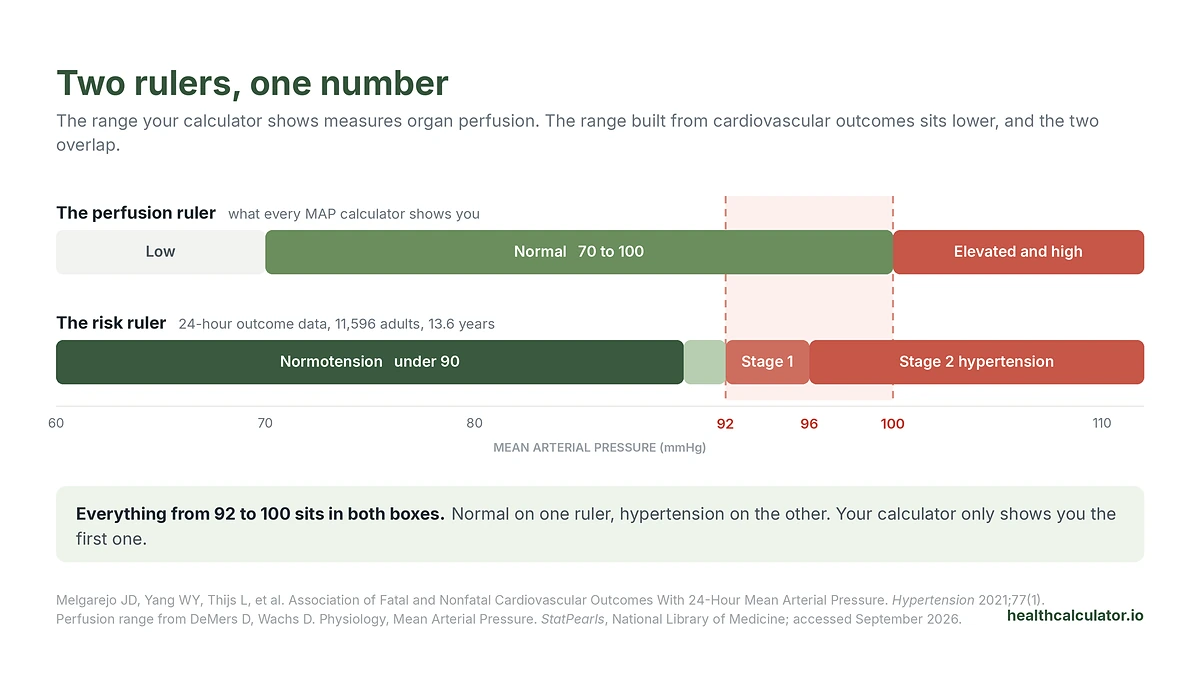
Look at where those numbers land. A 24-hour MAP of 96 is stage 2 hypertension by outcomes, and comfortably “normal” by the band on every calculator. The overlap zone, 92 to 100, is normal on one ruler and hypertension on the other.
A second cohort points the same way from a completely different direction. The Kailuan study tracked 19,171 Chinese adults with a mean age of 35.9 and sorted them by how their MAP moved over seven years. The low-stable group averaged 83.0 mmHg at baseline. The middle-stable group averaged 94.7. Both sit inside 70 to 100. In the fully adjusted model, the middle-stable group carried 2.49 times the risk of premature cardiovascular disease. People on a rising path, 5.91 times. Persistently high, 12.68 times.
Two large cohorts, different continents, different methods, both putting the inflection at roughly 92 to 95.
One critical caveat, because this is where people misread the data. Those 92 and 96 figures are 24-hour averages from an ambulatory monitor, not single cuff readings. In the same IDACO participants, office MAP averaged 97.4 while 24-hour MAP averaged 90.4. That is a gap of about 7 mmHg. So a home reading near 99 is roughly where a 24-hour average of 92 sits. Do not take a single reading of 93 and conclude anything. Take the trend, and take it to your doctor.
Your Reading to Your MAP, at a Glance
You typed a specific blood pressure into Google and wanted a specific number. Here it is, without the arithmetic.
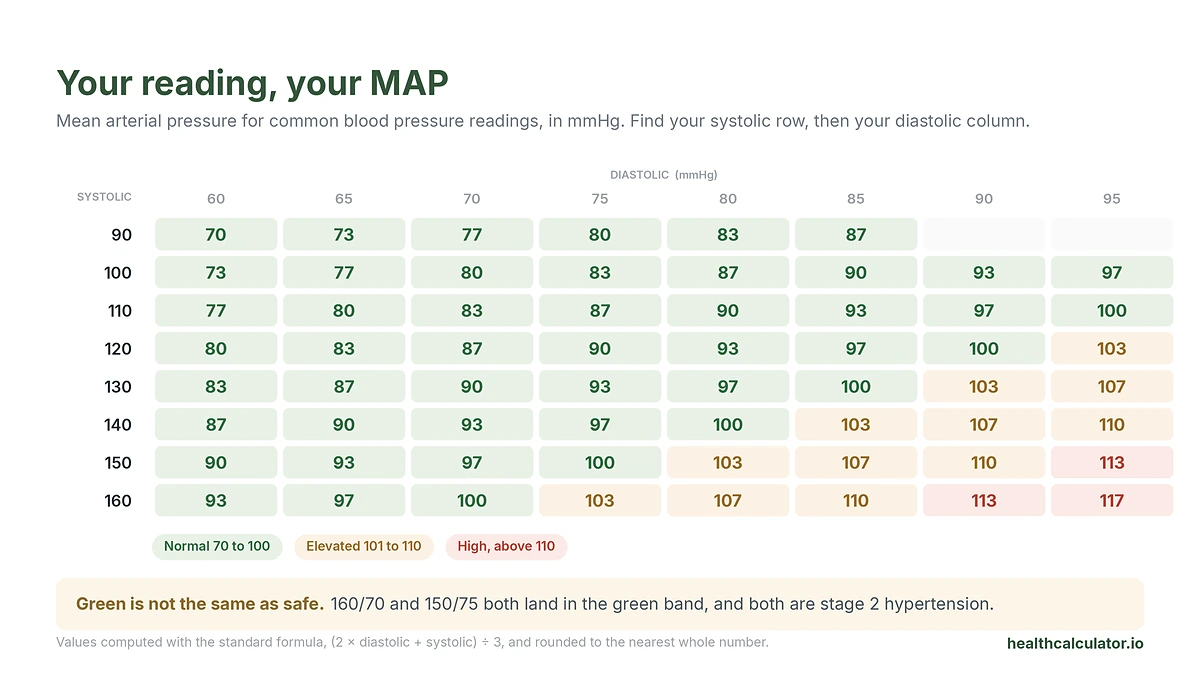
| SBP \ DBP | 60 | 65 | 70 | 75 | 80 | 85 | 90 | 95 |
|---|---|---|---|---|---|---|---|---|
| 90 | 70 | 73 | 77 | 80 | 83 | 87 | n/a | n/a |
| 100 | 73 | 77 | 80 | 83 | 87 | 90 | 93 | 97 |
| 110 | 77 | 80 | 83 | 87 | 90 | 93 | 97 | 100 |
| 120 | 80 | 83 | 87 | 90 | 93 | 97 | 100 | 103 |
| 130 | 83 | 87 | 90 | 93 | 97 | 100 | 103 | 107 |
| 140 | 87 | 90 | 93 | 97 | 100 | 103 | 107 | 110 |
| 150 | 90 | 93 | 97 | 100 | 103 | 107 | 110 | 113 |
| 160 | 93 | 97 | 100 | 103 | 107 | 110 | 113 | 117 |
Green in the calculator does not mean safe. Look at the 160 row: 160/70 gives 100, and 160/70 is stage 2 hypertension. That is the blind spot in one cell.
Normal MAP by Age: Does It Change as You Get Older?
The healthy target does not budge. 70 to 100, whether you are 25 or 75. The current guideline keeps a single diagnostic threshold of 130/80 mmHg for every adult, with no age adjustment.
What changes is where the average person lands, and why. Framingham showed systolic climbing steadily from 30 to 84 with diastolic and MAP rising alongside it, until roughly 50 to 60, when diastolic starts to fall while systolic keeps going. That divergence is arterial stiffening. Because MAP leans on diastolic, it rises through your 40s and 50s and then plateaus.
That plateau is comforting and slightly misleading. Your MAP is holding steady while your pulse pressure widens, and pulse pressure is the part that is doing damage. If you want the systolic and diastolic view of the same picture, see our blood pressure chart by age and gender.
And direction beats snapshot every time. That is the whole message of the Kailuan trajectories above. A MAP drifting up inside the normal range still raises your risk. Track it. Recheck it. Watch the things that push it, and carrying extra weight is a big one, which you can check with our BMI calculator.
What Your Calculated MAP Is Not
Every cuff-based MAP, our included, is an estimate built on one assumption: that true mean pressure sits exactly one third of the way up from diastolic to systolic.
It does not.
Researchers put intra-arterial lines into 79 people and measured where the real mean actually falls. The answer: 39.5% of pulse pressure above diastolic, not 33.3%. The standard formula underestimated true mean pressure by about 5 mmHg. A later study comparing formulas against invasive femoral recordings found the same direction of error and concluded the standard formula, while adequate for routine use, “on average will underestimate MAP.”
Here is the part that matters, and I have not seen it written anywhere else. The size of that error is not fixed. It scales with pulse pressure, at roughly 6% of the gap between your two numbers.
| Pulse pressure (SBP minus DBP) | Typical of | Formula understates true MAP by about |
|---|---|---|
| 40 | Healthy adult, 120/80 | 2.5 mmHg |
| 55 | Midlife, 140/85 | 3.4 mmHg |
| 70 | 148/78 | 4.3 mmHg |
| 90 | Isolated systolic hypertension, 160/70 | 5.6 mmHg |
Now put that next to Framingham. Pulse pressure rises steeply with age. So the formula’s error grows fastest in exactly the people whose MAP already understates their risk. The blind spot and the formula error push in the same direction, and they push hardest on the oldest arteries.
Should you stop using the calculator? No. Every reference band you compare against was built with the same formula, so the comparison is internally consistent. Just do not treat a cuff MAP of 66 as if it were the 65 an ICU measures through an arterial line. Those are different instruments.
Normal MAP for Athletes and Very Fit People
If you train hard and your MAP reads low, say 68 or 72, that is usually a feature.
Train regularly and your vessels change how they behave. A meta-analysis pooling 72 trials and 3,936 participants found endurance training cut systemic vascular resistance by 7.1%, plasma norepinephrine by 29% and renin activity by 20%, lowering resting blood pressure by about 3.0/2.4 mmHg overall and far more in people who were already hypertensive, at 6.9/4.9. Aerobic training drops pressure chiefly by relaxing vascular resistance.
It holds up in older athletes. Among 2,793 World Masters Games competitors, resting systolic ran 8.4% lower and diastolic 3.6% lower than the general Australian population, and only 8.1% were hypertensive versus 17.2% of the public. So a trained resting MAP in the high 60s or low 70s is usually fitness, not a fault.
Context still rules. A low MAP with dizziness, unusual fatigue or fainting is a different animal from a low MAP in someone who feels strong and recovers well. If you are athletic and want the wider picture, tracking body composition with our body fat calculator gives useful context alongside your MAP.
Normal MAP in Pregnancy, and Why Doctors Watch It
Pregnancy flips the script. Here a mildly high MAP earns real attention, early.
In a 2025 cohort of 2,169 pregnancies, 230 developed preeclampsia. Median MAP at the first prenatal visit was 92 mmHg among those women, versus 85 mmHg among those who stayed healthy. Seven mmHg, visible months ahead. The optimal warning cut-point landed at 88.5 mmHg, and first-visit MAP slightly outperformed the standard USPSTF risk checklist, with an AUROC of 0.71 against 0.66.
The authors are careful, and so am I: early pregnancy MAP is a “modest predictor,” useful as an adjunct to risk stratification rather than a test on its own. Which is exactly how your prenatal team will use it. If you are pregnant and your readings are trending up, tell your provider rather than a calculator.
Normal MAP Targets in Hospital and Critical Care
This is where the famous 65 comes from, and why it is not your target.
The 2026 Surviving Sepsis Campaign guideline recommends an initial MAP target of 65 mmHg over higher targets for adults with septic shock, noting that holding exactly 65 is impractical so a range within about 5 mmHg is reasonable. For patients aged 65 and over, the same guideline now conditionally recommends an initial range of 60 to 65 mmHg.
That lower range for older patients came out of a trial. The 65 Trial randomized 2,600 critically ill patients aged 65 and over to permissive hypotension, a MAP target of 60 to 65, or usual care. Ninety-day mortality was 41.0% versus 43.8%, an absolute difference of 2.85 percentage points that was not statistically significant. What the lower target did deliver was less vasopressor exposure with no added harm, which is why it is now in the guideline.
The lesson for you at home: 65 is an emergency floor for the sickest monitored patients on drugs. If your resting MAP is in the 70s or 80s and you feel well, you are nowhere near that conversation.
How Our MAP Calculator Compares to the Others
I checked what the tools most people land on actually give you. Every row below was verified by opening the page.
| Tools | Formula | Normal range given | Perfusion floor | Age or fitness context | Outcome risk data | Flags the systolic blind spot | Notes formula underestimates |
|---|---|---|---|---|---|---|---|
| MDCalc | Standard | None stated | 60, and 65 in sepsis | No | No | No | No |
| Omni Calculator | Standard | 70 to 100 | 60, and 65 in sepsis | No | No | No | No |
| GE HealthCare | Standard | 70 to 100 | 60 | Neonates only | Mentioned, not quantified | No | Yes, in general terms |
| Healthline | Standard | 70 to 100 | 60 | No | No | No | No |
| HealthCalculator.io | Standard | 70 to 100 | 60, and 65 in sepsis | Yes | Yes, IDACO and Kailuan | Yes | Yes, quantified |
Two honest observations. First, everyone uses the same formula, so everyone returns the same number, and choosing a “more accurate MAP calculator” is not a real decision. Second, MDCalc is a clinician tool and deliberately gives no consumer normal band, which is a defensible choice for its audience but leaves you with a number and no meaning.
Where I think our earns its place is after the arithmetic. Same number, more context.
What to Do If Your MAP Is Outside the Normal Range
Low, high, or drifting the wrong way. Here is a sensible order of operations.
Recheck properly first. Seated, feet flat, five minutes of rest, no caffeine or nicotine beforehand, and average two readings. Run it through our MAP calculator again to confirm the category. Then check the two raw numbers against 130/80, because that is the threshold that actually diagnoses hypertension.
If your MAP is consistently below 60 or above 110 across several days, or any reading comes with dizziness, chest pain or a severe headache, book a doctor’s visit. Pattern beats outlier.
Then look at the drivers. Kidney health and blood pressure are tightly linked, so our GFR calculator estimates how well your kidneys are filtering. If blood sugar is on your radar, the A1C calculator tracks your three month average. And since dehydration nudges pressure around, the water intake calculator is an easy win. Small steady habits move MAP more reliably than any single dramatic change.
This article is for informational and screening purposes only and does not constitute medical advice, diagnosis, or treatment. A MAP reading outside the normal range is not a diagnosis, and a reading within it does not rule out a condition. Always consult a qualified healthcare professional to interpret your result in the context of your full clinical picture.
Frequently Asked Questions
For most healthy adults at rest, a normal mean arterial pressure is 70 to 100 mmHg. About 60 mmHg is the minimum needed to perfuse vital organs, and above 110 mmHg suggests real arterial strain. That band measures organ perfusion, not cardiovascular risk, so treat it as a screening reference point rather than a verdict.
The healthy target of 70 to 100 mmHg stays the same at every adult age, and the current guideline keeps one diagnostic threshold of 130/80 for all adults. What changes is the average. Framingham data show systolic rising from age 30 to 84 while diastolic declines after 50 to 60, so MAP climbs through midlife and then plateaus.
A blood pressure of 120/80 gives a MAP of 93 mmHg, which sits inside the normal band. Useful comparisons from the same table: 110/70 gives 83, 110/60 gives 77, 100/70 gives 80, 130/80 gives 97 and 140/90 gives 107. The formula is diastolic doubled, plus systolic, divided by three.
Yes, and this is MAP’s biggest weakness. Because the formula counts diastolic twice, 180/60, 170/65, 160/70 and 150/75 all return a MAP of exactly 100 mmHg, the top of the normal band. All four are stage 2 hypertension. Always read your systolic and diastolic first.
A MAP of 65 sits at the lower edge of normal and is the clinical target floor in septic shock, where the 2026 guideline recommends an initial target of 65 mmHg, or 60 to 65 in patients aged 65 and over. For a healthy adult at rest it is generally acceptable, but persistent readings this low with lightheadedness deserve a doctor’s opinion.
Often, yes. Endurance training lowers resting pressure mainly by reducing vascular resistance by 7.1% in pooled trial data, so a fit person can sit healthily in the high 60s to low 70s. Among master athletes, only 8.1% were hypertensive versus 17.2% of the general population. A low MAP with dizziness or fainting is different and worth checking.
Early MAP is watched as a preeclampsia screening marker. In a 2025 cohort of 2,169 pregnancies, median MAP at the first prenatal visit was 85 mmHg in women who stayed healthy versus 92 in those who later developed preeclampsia, with 88.5 as the optimal cut-point. The authors call it a modest predictor, so follow your prenatal team’s guidance.
Conventionally, above 110 mmHg signals significant strain and 101 to 110 counts as elevated. Outcome data set the bar lower: in 11,596 adults followed 13.6 years, a 24-hour MAP of 92 to 96 mmHg carried a hazard ratio of 1.32, and 96 or above carried 1.77. Both sit inside the conventional normal band.
The number is identical. MDCalc, Omni Calculator and this site all use the same standard formula, so any MAP calculator returns the same result. The difference is interpretation: MDCalc is built for clinicians and states only the 60 mmHg perfusion floor, with no consumer normal band, no age context and no risk data.
Sources
Every figure on this page is drawn from peer-reviewed research, clinical guidelines, or government health statistics. Last verified September 2026.
- Melgarejo JD, Yang WY, Thijs L, et al. Association of Fatal and Nonfatal Cardiovascular Outcomes With 24-Hour Mean Arterial Pressure. Hypertension. 2021;77(1). doi:10.1161/HYPERTENSIONAHA.120.14929.
- DeMers D, Wachs D. Physiology, Mean Arterial Pressure. In: StatPearls. StatPearls Publishing; updated 10 April 2023. PMID: 30855814.
- National Center for Health Statistics. High Blood Pressure Facts. Centers for Disease Control and Prevention; reviewed 2 June 2026.
- American Heart Association. New high blood pressure guideline emphasizes prevention, early treatment to reduce CVD risk. American Heart Association; 14 August 2025.
- Franklin SS, Gustin W, Wong ND, et al. Hemodynamic Patterns of Age-Related Changes in Blood Pressure: The Framingham Heart Study. Circulation. 1997;96(1):308–315.
- Song Z, Zhao H, Wei Z, et al. Mean arterial pressure trajectory with premature cardiovascular disease and all-cause mortality in young adults: the Kailuan prospective cohort study. Frontiers in Cardiovascular Medicine. 2023;10:1222995. doi:10.3389/fcvm.2023.1222995.
- Bos WJW, Verrij E, Vincent HH, Westerhof BE, Parati G, van Montfrans GA. How to assess mean blood pressure properly at the brachial artery level. Journal of Hypertension. 2007;25(4):751–755.
- Tien LYH, Morgan WH, Cringle SJ, Yu DY. Optimal Calculation of Mean Pressure From Pulse Pressure. American Journal of Hypertension. 2023;36(6):297–305.
- Cornelissen VA, Fagard RH. Effects of Endurance Training on Blood Pressure, Blood Pressure-Regulating Mechanisms, and Cardiovascular Risk Factors. Hypertension. 2005;46(4):667–675.
- Climstein M, Walsh J, DeBeliso M, et al. Resting Blood Pressure in Master Athletes: Immune from Hypertension? Sports (Basel). 2023;11(4):85. doi:10.3390/sports11040085.
- Waks AB, Milone G, Oakes MC. Mean arterial pressure at the first prenatal visit as an early predictor of preeclampsia. Pregnancy. 2025;1(2):e70001. doi:10.1002/pmf2.70001.
- Society of Critical Care Medicine. Surviving Sepsis Campaign: International Guidelines for Management of Sepsis and Septic Shock 2026. Society of Critical Care Medicine; 23 March 2026.
- Lamontagne F, Richards-Belle A, Thomas K, et al. Effect of Reduced Exposure to Vasopressors on 90-Day Mortality in Older Critically Ill Patients With Vasodilatory Hypotension: A Randomized Clinical Trial. JAMA. 2020;323(10):938–949. doi:10.1001/jama.2020.0930.